Washington Department of Fish & Wildlife
| ABOUT: | Prototype responsive website for Washington Department of Fish & Wildlife |
| ROLE: | Art direction, design, UX/UI design, and HTML, CSS coding |
| CLIENT: | Personal |
| SOFTWARE: | Photoshop, Illustrator, BBEdit |
| DATE: | 2017 |
Overview
This project is a concept that stemmed from a lost fishing license. It had been purchased but misplaced and the idea for the online version of a license seemed like a no-brainer. (Although the WDFW does get a fee for every license reprinted, this idea may reduce their profit, but it is unknown). And thinking through it further, it seemed that it would benefit the WDFW by having up-to-the-minute data on all fishing in the state. Every angler would be able to update their catch card immediately instead of having to wait until the end of the season to return their hand-printed license by snail mail, or submit a form online. It might reduce the need to send Fisheries employees to ports to ask for daily catches in person as well. And it would also be a great place to put emergency closure information, corrections, and updates, instead of on the WDFW website, since it would be a responsive website every angler could have on their mobile device.One issue was to decide whether or not to include EVERY bit of information that is included in the 138-page printed pamphlet issued every year at the beginning of fishing season. Some of the information in the pamphlet, while very important, wouldn't necessarily be valuable in mobile form, or while actually fishing. This site aims to narrow down the most relevant information needed for being on the water, and organize it in an easy to find, meaningful way.
Sitemap
After studying the Sport Fishing Rules Pamphlet for the 2016-2017 fishing year, the sitemap was started. It went through a few iterations before it was determined what actual pages would be included in the website, and the order in which they would be displayed. The sitemap also determined which pages would use the same basic layout or template, but different information (i.e. westside lakes and eastside lakes, all marine area pages, etc.).
Wireframes
The next step was creating wireframes of unique pages and templates. This is where the usability of the site was established.
Palette
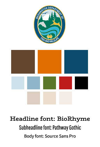
I took queues from the existing WDFW website (http://wdfw.wa.gov/licensing/fishing.html), the license registration site (https://fishhunt.dfw.wa.gov/#/login), and the current branding of the agency. I needed to redraw the logo in Illustrator, since I had no vector version of it. Also, all of the maps and diagrams were redrawn by hand from screenshots of the pamphlet into Illustrator.
Comp Review
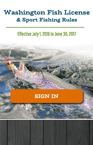
Since this was a personal project, and no client approval was needed, I only created a Photoshop comp of the homepage to get a sense for the site look-and-feel. This also went through several iterations before deciding on the final design. I wanted to use Google fonts for the site as well, so careful consideration went into choosing the right typography for the style of the site. After completing the homepage design, I used the wireframes for the downlevel pages and jumped right into coding the site.
Live Site
I began with a simple framework I like to use to make responsive websites. It's much cleaner and leaner than Bootstrap, and only uses 4 columns instead of 12. This site is just a basic HTML framework/clickable mockup for the time being. It isn't a functioning website in the sense that there is no database -- the submit buttons do not submit any information, and the search forms are not functioning. It's still a work in progress as far as the content as well -- not all the popup boxes are working, and there may be some information or links still missing. I am hoping to include clickable/touchable definitions on certain words or phrases for better usability as well.

